
The United Nations adopted the Sustainable Development Goals (SDGs) in 2015. SDG2 addresses food security. The Food and Agriculture Organization (FAO) of the UN defines food security as, “…when all people, at all times, have physical and economic access to sufficient, safe and nutritious food that meets their dietary needs and food preferences for an active and healthy life.”
While defining food security may be easy, measuring food security and ultimately acting on it is complicated. Food security is typically measured across four dimensions: availability of food, access to food, utilization of food, and stability of food supply. Within these dimensions, many factors can undermine food security, such as economic instability, human conflict, lack of farming resources, and climate and geographic changes.
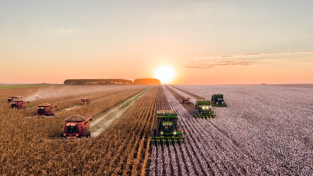
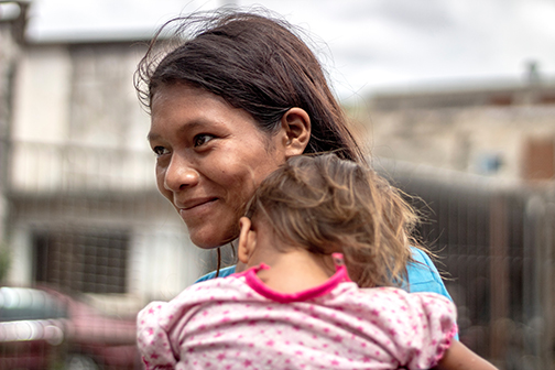
Disruptions in food production and affordability resulting from the Covid-19 pandemic have rolled back development gains that had been made by many countries prior to the pandemic, amplifying drivers of fragility and conflict. In the Latin America and Caribbean (LAC) Region alone, as of July 2020 the World Food Programme estimated up to 16 million people were facing severe food insecurity, up from 4.3 million in 2019.
 To have a holistic picture of food insecurity in a country, multiple contributing factors need to be quantified and analyzed. Agreeing on a common set of numbers is challenging, because many international development organizations, such as the World Food Programme, FAO, and the World Bank, collect their own sets of food security data. The multiple data sources, dissimilar formats, different frequencies of collection, and varying levels of quality exacerbate the problem of being able to identify early declines in food security.
World Bank staff are able to make use of the available data, but further enhancements would help meet long-term needs for systematic analysis and interpretation of the data, which is critical for understanding the drivers of food insecurity. Importantly, more robust analytical capacity would enable World Bank country teams to more quickly and effectively identify emerging food insecurity hotspots and mobilize appropriate responses.
To have a holistic picture of food insecurity in a country, multiple contributing factors need to be quantified and analyzed. Agreeing on a common set of numbers is challenging, because many international development organizations, such as the World Food Programme, FAO, and the World Bank, collect their own sets of food security data. The multiple data sources, dissimilar formats, different frequencies of collection, and varying levels of quality exacerbate the problem of being able to identify early declines in food security.
World Bank staff are able to make use of the available data, but further enhancements would help meet long-term needs for systematic analysis and interpretation of the data, which is critical for understanding the drivers of food insecurity. Importantly, more robust analytical capacity would enable World Bank country teams to more quickly and effectively identify emerging food insecurity hotspots and mobilize appropriate responses.
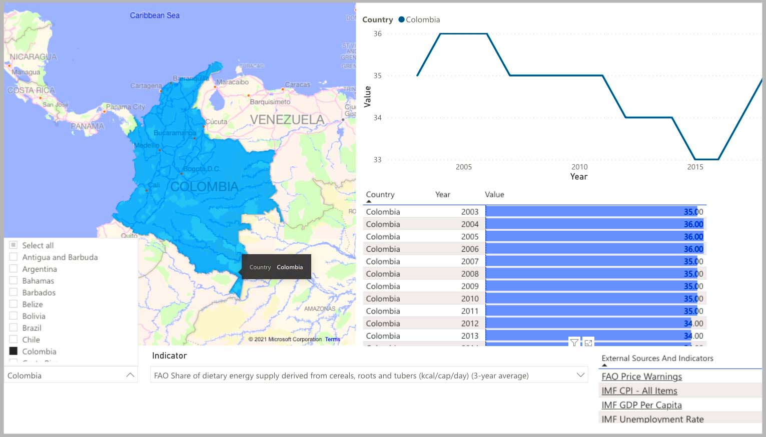
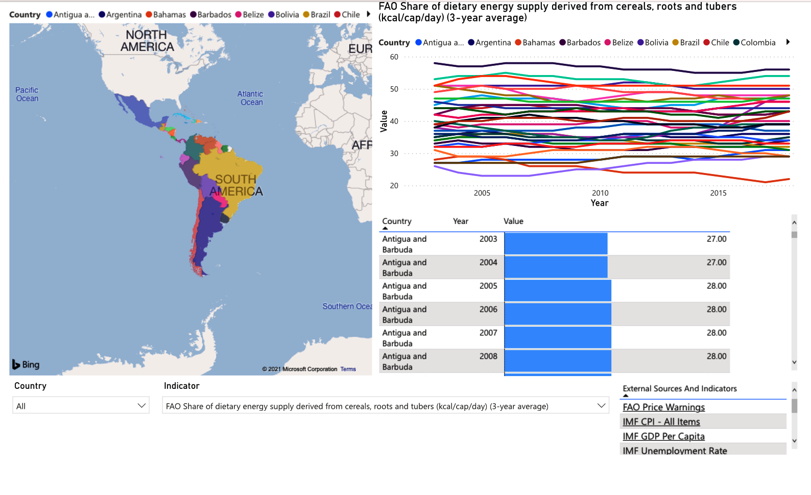
To improve the World Bank’s capacity to monitor food security in the LAC Region, the World Bank and the DxHub worked with four students from the Cal Poly Master of Science in Quantitative Economics program to create a dashboard which ingests data from multiple, data sources. The DxHub-student team chose to use Jupyter Notebook with Amazon SageMaker Notebooks to develop their code to ingest data. To visualize the data, the team used PowerBI, a visualization tool used by the World Bank, to create a multi-page dashboard that allows users to visualize trends across multiple data points for multiple countries. In addition, the students produced a paper in which they compared predictive models based on the Global Food Security Index (GFSI).
 For data ingestion, the team worked with data sources from WFP, FAO and the World Bank, pulling in 44 indicators from 33 countries. These data sources came in multiple formats and had to be cleaned up and fit into a standard structure and CSV format using Python. Many of the indicators had different timescales and needed to be broken up to fit within a common timescale, so that they could be easily displayed on a dashboard.
 The CSV files were then imported into PowerBI as a data source for visualization. The dashboard includes a page on each of the following: a comparison of one indicator across all countries; a comparison of all indicators and their trends within a specific country; all indicators for all countries for a given year; and data coverage for each country. World Bank staff expect to use this dashboard for internal monitoring and reporting on food security in the LAC Region going forward.
Building on the data visualization work, the students trained a model to predict food insecurity in countries in the LAC Region. Using historical data, they compared the results produced by their model with the results generated by three other regression models currently in use, to assess their relative abilities to predict GFSI scores. The findings of this exercise were written up in a paper that can be found in the “Supporting Documents” section below.
“Our team was very impressed with the Cal Poly students. Their commitment, creativity, and insight made the partnership an enriching experience for us. We hope they continue to explore data solutions to development challenges going forward in their careers,” said Leah Arabella Germer, Agriculture Analyst, Agriculture Global Practice, World Bank.
The CSV files were then imported into PowerBI as a data source for visualization. The dashboard includes a page on each of the following: a comparison of one indicator across all countries; a comparison of all indicators and their trends within a specific country; all indicators for all countries for a given year; and data coverage for each country. World Bank staff expect to use this dashboard for internal monitoring and reporting on food security in the LAC Region going forward.
Building on the data visualization work, the students trained a model to predict food insecurity in countries in the LAC Region. Using historical data, they compared the results produced by their model with the results generated by three other regression models currently in use, to assess their relative abilities to predict GFSI scores. The findings of this exercise were written up in a paper that can be found in the “Supporting Documents” section below.
“Our team was very impressed with the Cal Poly students. Their commitment, creativity, and insight made the partnership an enriching experience for us. We hope they continue to explore data solutions to development challenges going forward in their careers,” said Leah Arabella Germer, Agriculture Analyst, Agriculture Global Practice, World Bank.