

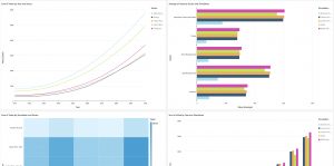
 The DxHub worked with five master’s candidates in Cal Poly’s Orfalea College of Business – Business Analytics program. The team decided to approach the problem with two different technologies. This first was intended to easily consume and visualize model data. The team chose AWS QuickSight, a cloud-based Business Intelligence (BI) tool that is part of AWS business solutions. The team used QuickSight to create a series of sample dashboards using custom filters and graphics that are easy for users to update. Each dashboard contains a set of data filters that were preconfigured to automatically update any chart, graph, or table on the dashboard tab without a user having to manually parse the data and/or edit a graphic.
Using QuickSight, metrics used to assess changes or variations in variable sets are coded as calculated fields. The team created a series of simple calculation fields that can compare and contrast variables across columns or rows.
The team also looked at an open-source solution to the problem, the R-package Shiny, which is used by data scientists to analyze datasets and create visuals to help visualize patterns. The team used an AWS EC2 instance and AWS Elastic Load Balancer to build a custom Shiny dashboard from the ground-up. The big advantage of the Shiny solution was its low licensing costs and the flexibility it gave the Bank and its clients
The DxHub worked with five master’s candidates in Cal Poly’s Orfalea College of Business – Business Analytics program. The team decided to approach the problem with two different technologies. This first was intended to easily consume and visualize model data. The team chose AWS QuickSight, a cloud-based Business Intelligence (BI) tool that is part of AWS business solutions. The team used QuickSight to create a series of sample dashboards using custom filters and graphics that are easy for users to update. Each dashboard contains a set of data filters that were preconfigured to automatically update any chart, graph, or table on the dashboard tab without a user having to manually parse the data and/or edit a graphic.
Using QuickSight, metrics used to assess changes or variations in variable sets are coded as calculated fields. The team created a series of simple calculation fields that can compare and contrast variables across columns or rows.
The team also looked at an open-source solution to the problem, the R-package Shiny, which is used by data scientists to analyze datasets and create visuals to help visualize patterns. The team used an AWS EC2 instance and AWS Elastic Load Balancer to build a custom Shiny dashboard from the ground-up. The big advantage of the Shiny solution was its low licensing costs and the flexibility it gave the Bank and its clients  to modify the project and add in new functionality. The Shiny dashboard allows users to save filters for re-use, which in turn allow mutually dependent filter inputs, graphs, and formulas for transforming the values. The dashboard also has formulas that support calculated differences between simulations and show percentage differences between simulations. This solution also allows users to save preconfigured graph and filter settings in a custom configuration file.
The student team presented their findings to the World Bank macroeconomic modelling team, identifying the tradeoffs between the two technologies during their demonstration. The World Bank team was pleased with the students’ efforts and saw promise in both the AWS Quicksight and R-Shiny solutions, and is now exploring how the student-led proofs of concept can be extended to become part of regular World Bank solutions offered to developing country governments.
“Working with the DxHub team and Orfalea College of Business Analytics students was a real pleasure. Their enthusiasm and energy was contagious and has resulted in a product that could really make a difference as countries explore policy options to increase growth and reduce poverty,” commented Hasan Dudu, Senior Economist and Modeler who led the World Bank side of this collaboration.
to modify the project and add in new functionality. The Shiny dashboard allows users to save filters for re-use, which in turn allow mutually dependent filter inputs, graphs, and formulas for transforming the values. The dashboard also has formulas that support calculated differences between simulations and show percentage differences between simulations. This solution also allows users to save preconfigured graph and filter settings in a custom configuration file.
The student team presented their findings to the World Bank macroeconomic modelling team, identifying the tradeoffs between the two technologies during their demonstration. The World Bank team was pleased with the students’ efforts and saw promise in both the AWS Quicksight and R-Shiny solutions, and is now exploring how the student-led proofs of concept can be extended to become part of regular World Bank solutions offered to developing country governments.
“Working with the DxHub team and Orfalea College of Business Analytics students was a real pleasure. Their enthusiasm and energy was contagious and has resulted in a product that could really make a difference as countries explore policy options to increase growth and reduce poverty,” commented Hasan Dudu, Senior Economist and Modeler who led the World Bank side of this collaboration.